Hi there 👋
I had the immense privilege of joining a marketing AMA last week with Emily Kramer of MKT1. If you’ve yet to subscribe to the email newsletter she runs with her MKT1 partner Kathleen Estreich, it is a must read. Emily also runs a B2B marketing masterclass course that is a must-attend. Anyway, as part of the AMA, Emily asked this question:
What are some early-stage companies you think are doing a great job at marketing?
I just so happen to keep a swipe file of these companies! So this week’s newsletter is inspired by Emily’s question and is an ode to the early-stage companies who have inspired me recently.
Wishing you a great week ahead,
Kevan
(ᵔᴥᵔ)
Thank you for being part of this newsletter. Each week, I share playbooks, case studies, stories, and links from inside the startup marketing world and my time at Oyster, Buffer, and more.
Say hi anytime at hello@kevanlee.com. I’d love to hear from you.
10 fresh homepages that ooze marketing excellence
They say your homepage is like your storefront.
They also say a homepage has one job: Get a visitor to take an action.
Or maybe the one job is to get people to stop and stay.
Or maybe it’s two jobs: clearly articulating who you are and what you sell.
Regardless of the main reason why your homepage matters, it’s obvious that every job a homepage does is critically important for a company. I’m very proud of the homepage we’ve built at Oyster because it is a clear articulation of what we do as a business, it is very on-brand with who we are and what we do, and it is unique among all the other competitors in our space.
I keep a swipe file of bookmarks for new homepages that catch my eye, especially from up-and-coming startups. There are a lot of good homepages out there. Here are 10 of my recent favorites.
Hopefully they’ll provide some inspiration and ideas for your next homepage project.
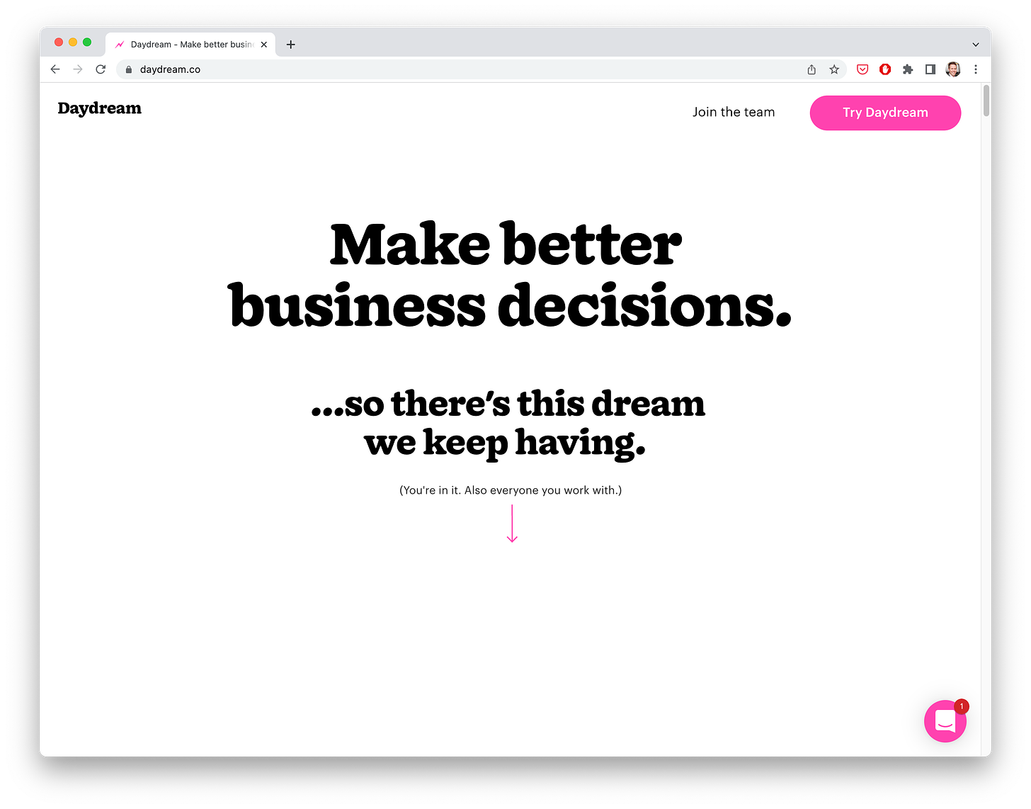
1. Daydream
My screenshot above does not do the Daydream homepage justice. Because beneath the hero text and the arrow lies an immersive story about our modern world of work and how Daydream is here to save us from mindlessly pulling virtual levers and twisting digital knobs. It’s one of the very best and bravest websites I’ve seen in a long time!
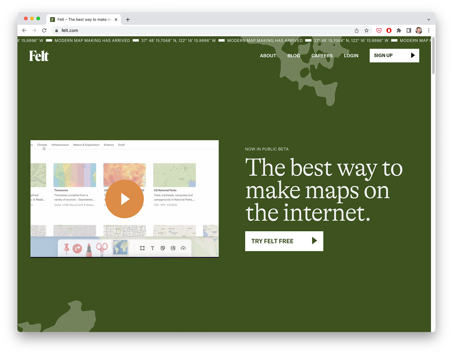
2. Felt
The Felt homepage has many of the classic startup-marketing homepage tactics I love: a big bold button to get started for free, a video explainer right there in the header. But what sets it apart for me is the small and simple touches that add uniqueness to the brand experience — e.g. a subtle map texture throughout the site, a scrolling bar at the very top with latitude and longitude. It’s touches like this that make for memorable experiences these days.
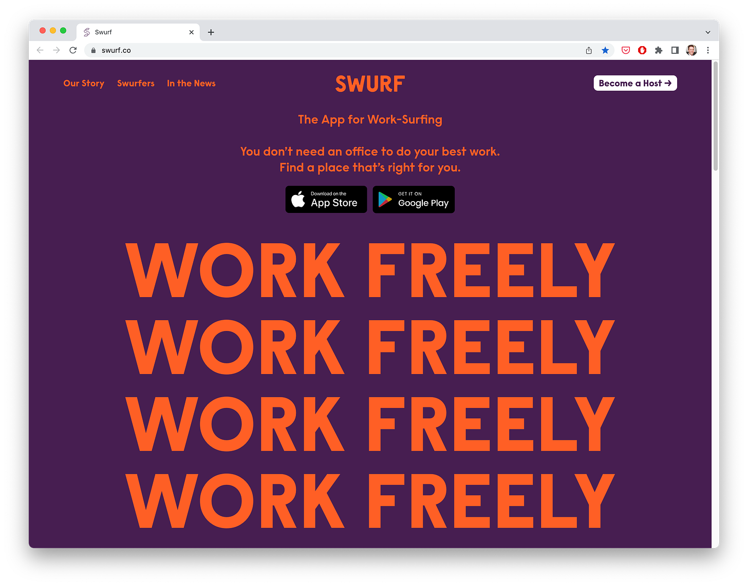
3. Swurf
I love homepages that stop you in your tracks. And this one stopped me in my tracks! Repetition, repetition, repetition. More companies should just copy/paste their value prop into the hero of their homepage four times.
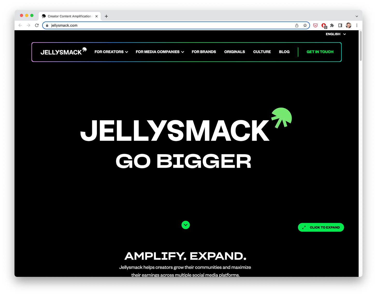
4. Jellysmack
For the full experience, you definitely need to click to see the homepage yourself. It’s an immersive video header that draws you in with story and color. Bold and risky … but very on-message for a company that helps content creators.
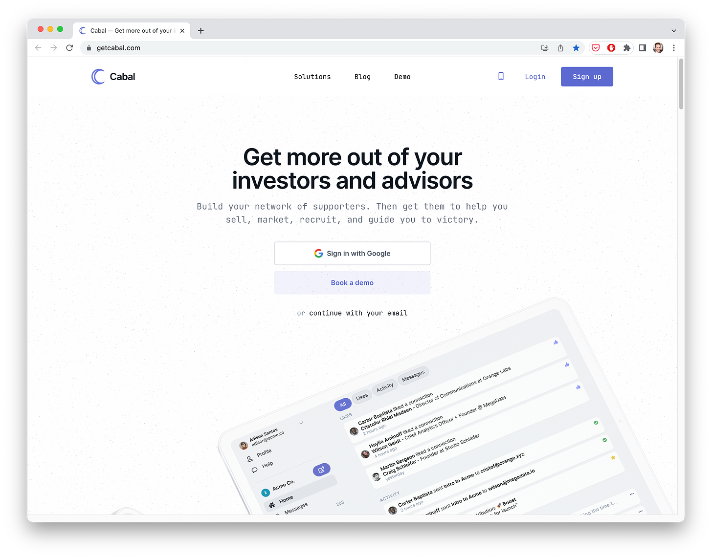
5. Cabal
What I love about Cabal’s website — and others like it — is their use of real language in the heading. No lingo or jargon. Just plain English that uses the words their target audience uses.
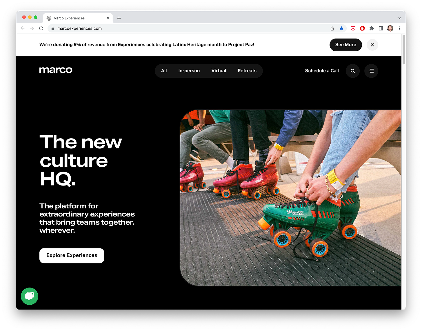
6. Marco Experiences
The Marco homepage is beautiful in so many ways (check out the photo carousel 😍). But I want to call out the unique use of the top banner. Marco is donating a percentage of revenue in honor of Latin Heritage month. Talk about an inspiring use of homepage real estate!
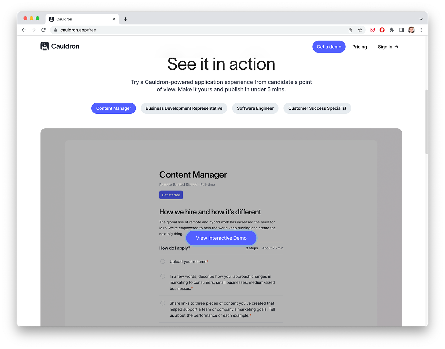
7. Cauldron
Big Product-Led Growth fan over here! So any time I see a homepage that gets you close up and personal to the core value of the product, I’m into it. Cauldron helps power the job applicant experience, which can be a hard thing to test out in a free trial. So Cauldron simply lets you poke around in a sandbox mode for every single one of its core use cases.
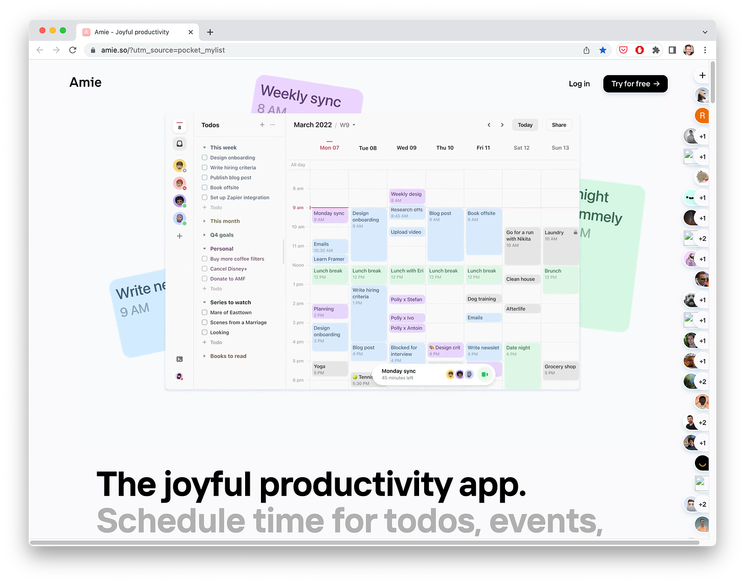
8. Amie
I’ve shared love for the Amie website in past newsletters, and here I am again. The design is beautiful, but what they’ve also done is pack in interactive social proof onto the right-hand sidebar. Check out the website and click on some avatars to see for yourself.
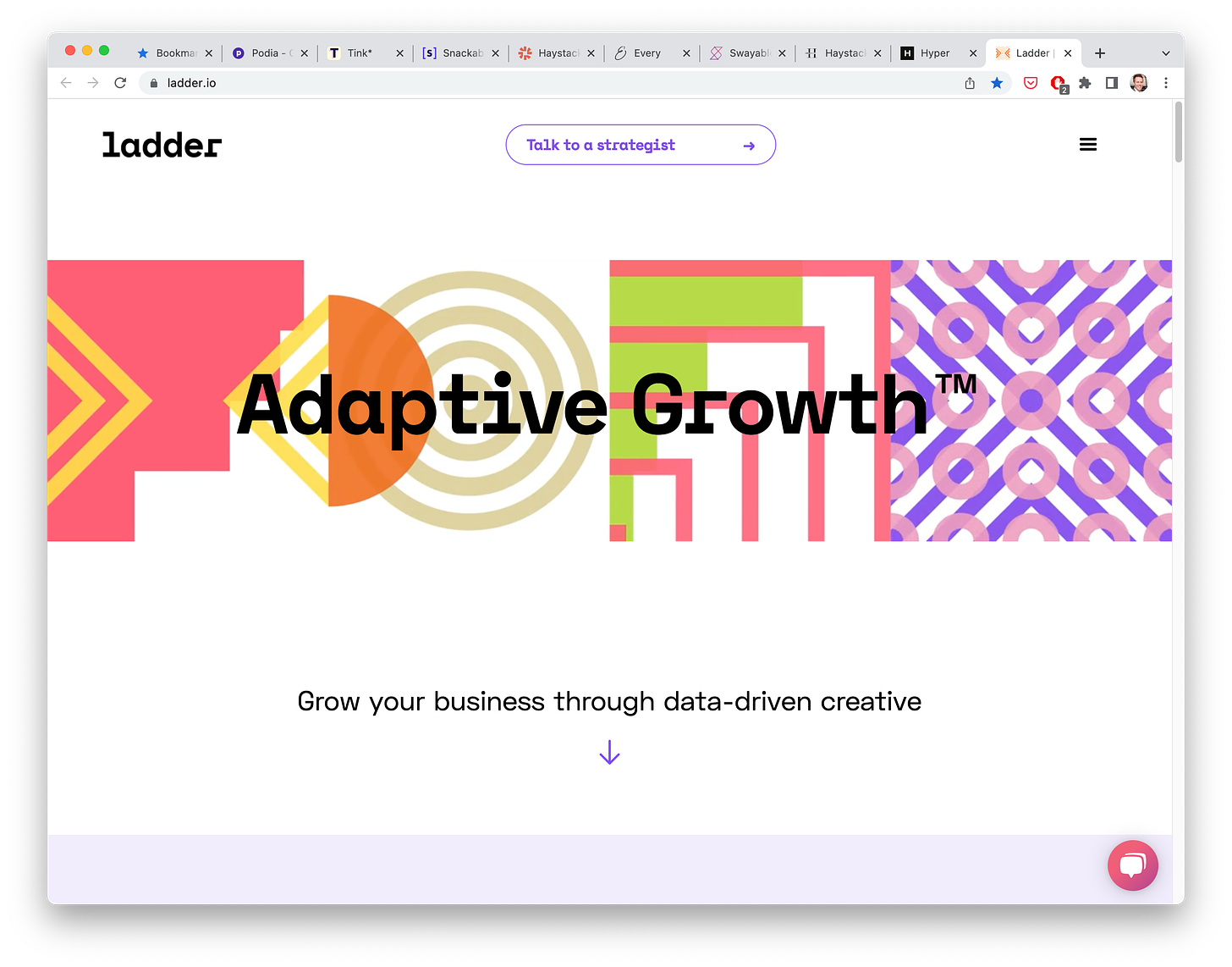
9. Ladder
I’m stretching the bounds of tech homepages with Ladder, a growth and creative service. But their homepage is simply too eye-catching to leave off this list. The copy is clear and creative. But the designs behind the headline are what really stop me in my tracks. They appear as the page loads, creating a cool experiential moment.
10. Rocket
One of the simplest websites out there … but for a very simple product. This is the epitome of a clear homepage. The site shows you exactly what the product does in real-time, typing emoji into lines of text. Brilliant.
Misc.
What is experiential marketing?
For my fellow book fans, the US’s National Book Award longlist is here
About this newsletter …
Hi, I’m Kevan, a marketing exec based in Boise, Idaho, who specializes in startup marketing and brand-building. I currently lead the marketing team at Oyster (we’re hiring!). I previously built brands at Buffer, Vox, and Polly. Each week, I share playbooks, case studies, stories, and links from inside the startup marketing world. Not yet subscribed? No worries. You can check out the archive, or sign up below:
Thank you for being here! 🙇♂️
I’m lucky to count folks from great brands like these (and many more) as part of this newsletter community.


