432. Website Inspo 🥹
432. Website Inspo 🥹
10 website trends worth copying for your startup's website
Hi there 👋
When you find an amazing website, what do you do? Slack it to a friend? Stash it in a swipe file? Take a screenshot with your phone? I’ve done all these, but my typical go-to move is to bookmark the site in Chrome, where it sits in a bookmark slush pile until the one time a year when I purge my bookmarks. There has to be a better way. If you have any tips on how this works for you, I’m all ears!
Wishing you a great week ahead,
Kevan
(ᵔᴥᵔ)
Thank you for being part of this newsletter. Each week, I share playbooks, case studies, stories, and links from inside the startup marketing world and my time at Oyster, Buffer, and more.
Say hi anytime at hello@kevanlee.com. I’d love to hear from you.
10 new trends for website inspiration and building a differentiated web presence
What is the job of a website?
This question should be a newsletter topic all its own. Because the answer is complicated.
Websites can serve many different jobs depending on the goals of the company. They can be about oozing professionalism, creating curiosity, explaining complicated products, educating new markets — sometimes they try to do all these things at once. That’s why it’s good to always have an experimental mindset with your site and not fall into the trap of “set it and forget it.”
Hopefully these examples of some cool and modern websites will be helpful food-for-thought as you iterate.
(Subjectivity warning: These are website trends I like. They may not be website trends you like. See how hard it is to make a “good” website?!)
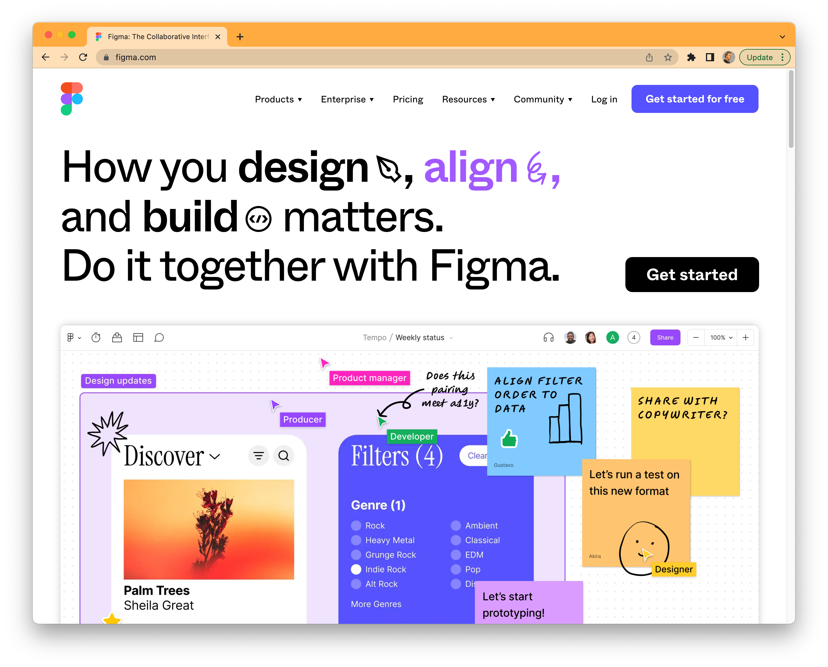
1 - Figma homepage — Just one headline, just one button, and an above-the-fold video
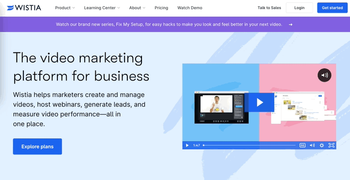
2 - Auto-playing GIF previews of video, thanks to Wistia
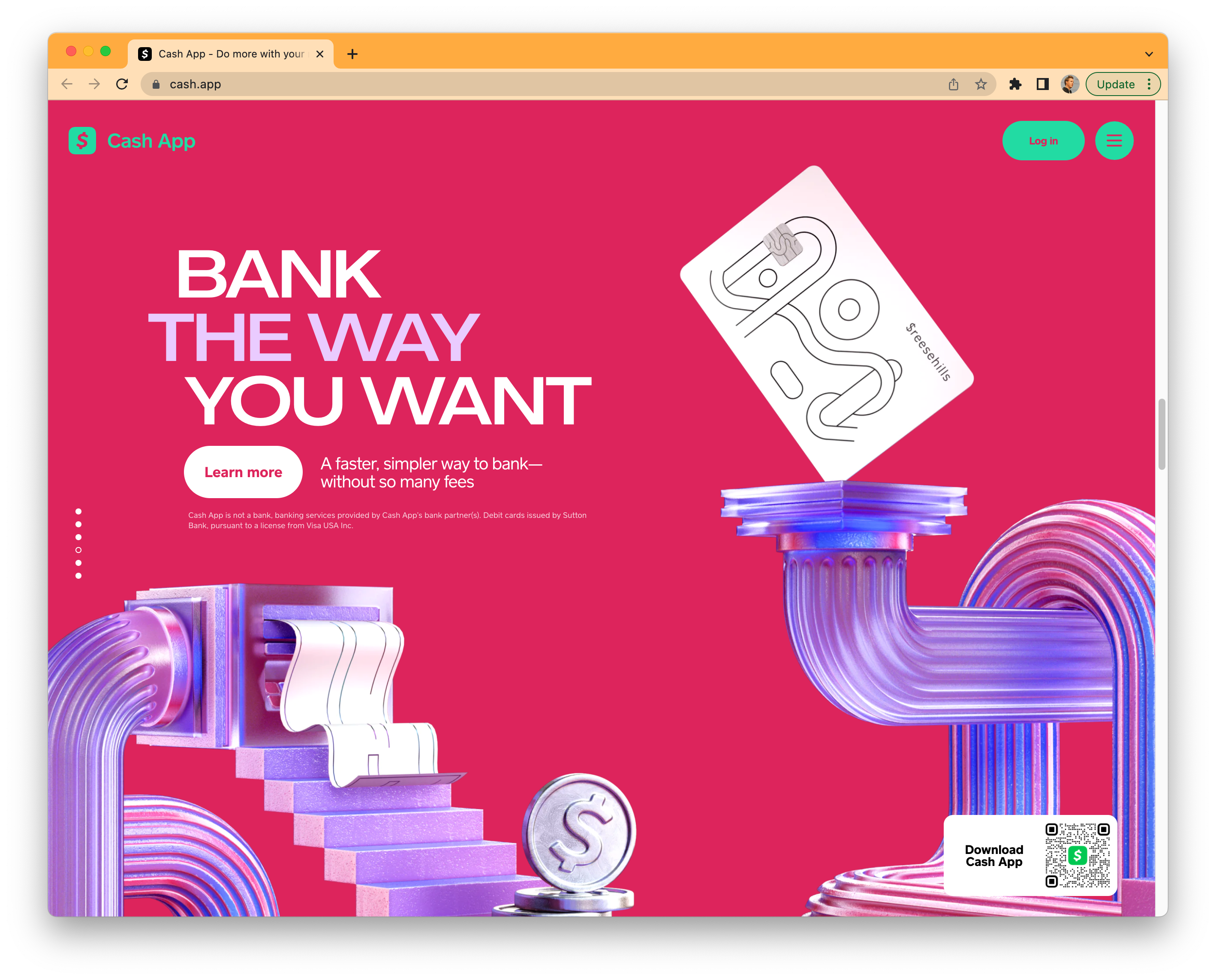
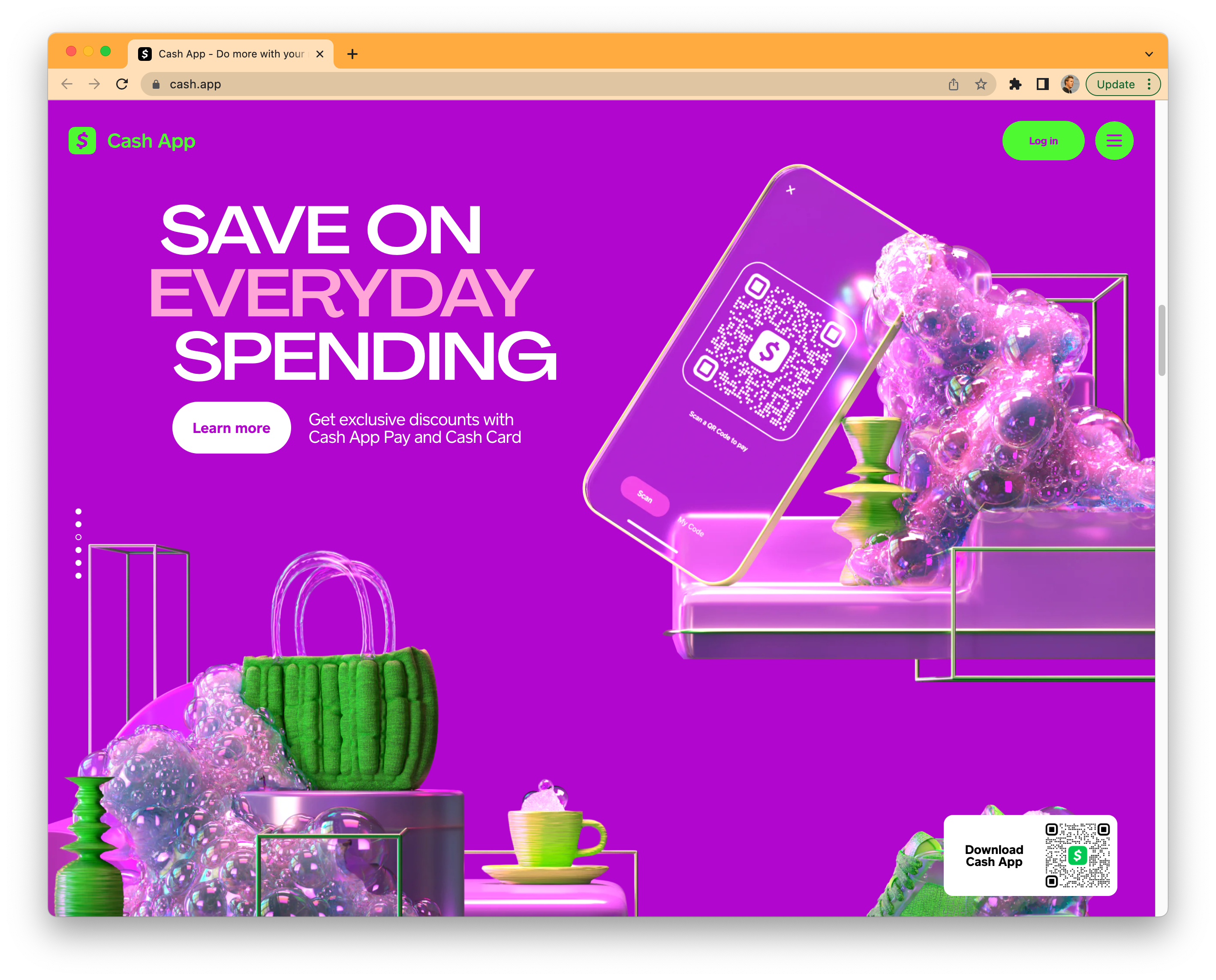
3 - Cash App’s hyperrealistic photography style
4 - Squarespace’s photo style, too — Realistic, earthy, non-digital despite selling software
5 - The GIANT signup button
6 - The rotating signup button
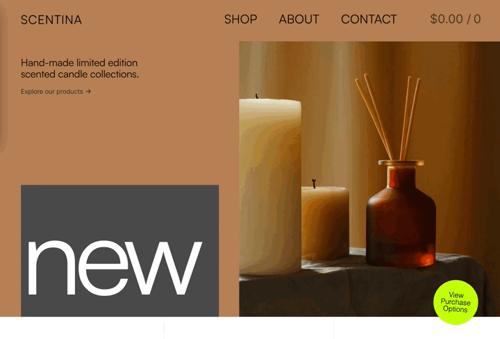
https://themeskingdom.com/demo/scentina/
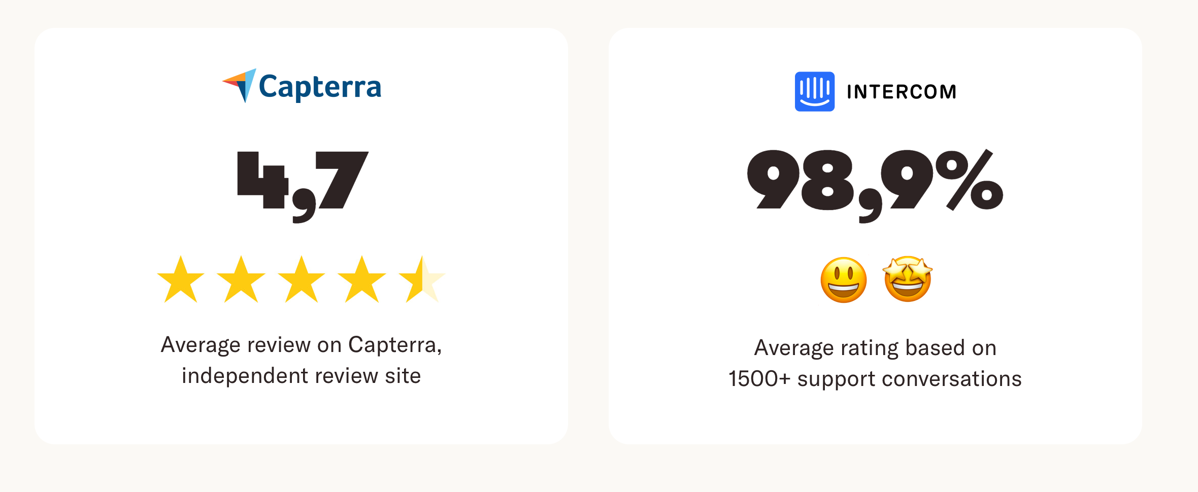
7 - Can’t-miss ways to embed social proof — even for your awesome support team [Intercom ratings]
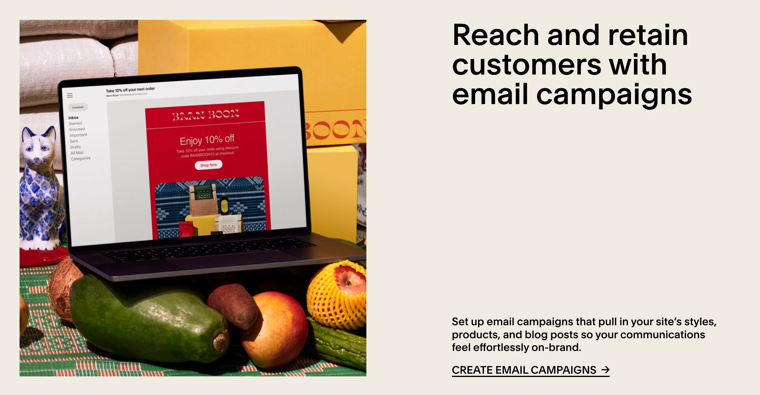
8 - A non-boring, editorial-style layout for a SaaS blog

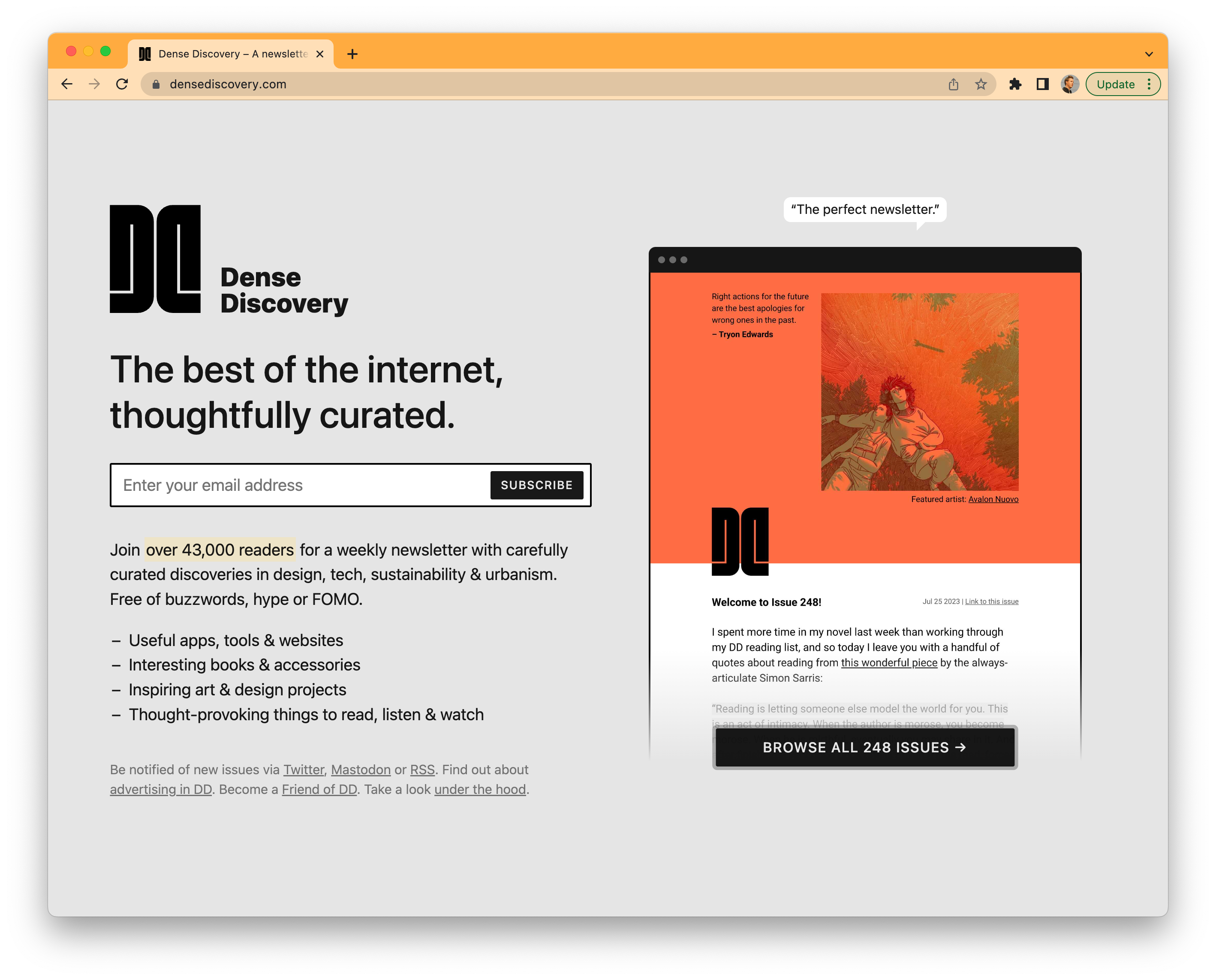
9 - Lead capture / email signup form that fits within a single browser view (no scrolling necessary!)
https://www.densediscovery.com/
10 - UI IRL — Communicating your digital product’s value within a real-world context
About this newsletter …
Hi, I’m Kevan, a marketing exec based in Boise, Idaho, who specializes in startup marketing and brand-building. I previously built brands at Oyster, Buffer, and Vox. Each week, I share playbooks, case studies, stories, and links from inside the startup marketing world. Not yet subscribed? No worries. You can check out the archive, or sign up below:
Thank you for being here! 🙇♂️
I’m lucky to count folks from great brands like these (and many more) as part of this newsletter community.